

Interaction design, Art direction, Visual design, and Media assets
Jarrod Pan, Emma Wu, Kelvin Liew, Kitty Cheung

Microsite snapshots
Fabrica is an interdisciplinary research centre based in Italy. Each year, they invite a curious and creative cohort of artists, designers, and researchers under the age of 25 to engage in a residency. Researchers interrogate modern methods of communication, moving between photography, video, design, music, and publication.
Use case
This microsite is meant to encourage emerging artists to apply for a residency by spotlighting Fabricanti (Fabrica’s residents), or program alumni projects.
Microsite Video Walkthrough
A post-event microsite serving as an online archive from the What If? explo curated by Fabrica’s residents. The microsite encapsulates the physical experience by createing a sense of immersion for visitors. By creating a unique identity for residents installations through visual and interaction design.
Design qualities
Cascading layers as navigation.
Movement to transform the screen into a 3D space.
Interaction to provoke creativity.
Cascading layers as navigation
This navigation system is intense and stimulating with its combination of movement, colour, and sound to suit the dynamicism of artists and media within Fabrica.
Movement to transform the space into a 3D space
Skewing the content across multiple planes transforms the screen into a 3D room. The user is invitinged into the space to get to know each artist and their work better.
Interaction to provoke creativity
Through click and dragging, you are able to move interactable collage elements within the container.
Landing and loading
The scrolling banner briefly contextualizes the functions and purpose of the website. Rings grow inwards to build emphasis on the navigation format. Nested shapes and leading lines bring attention to the center.
Throughout a 3 week period in an engaged graphic experimentation process an investigation of greats such as, Chris Ashworth, Ellen Lupton, and Wolfgang Weingart occured. Among these prominent designers we investigated unique design principles and qualities to be derived and extracted into our own understanding. Doing so, creates a unique identity for our microsite and not based by designing in our heads.
Chris Ashworth, an art director and designer of music magazine Ray Gun, developed a distinct aesthetic called, “Swiss Grit.” The rebellious grunge grandchild of Swiss Design. Ashworth added a soulful grittiness characterized by imperfection, distorted type, and messy physical textures.
Design qualities derived from Chris Ashworth works:
1. Framing for hierachy
2. Textures to create contrast
3. Layers to create depth
Chris Ashworth examples
Framing for hierachy
Tools such as perspective lines, holes “punched” through, and shapes are used to frame imagery. This framing directs the viewer’s eye, thereby creating an order of hierarchy and depth.
Textures to create contrast
A variety of textures are combined and contrasted. For example, Ashworth’s messier textures such as ripped prints, peeling tape, and white-out splotches are contrasted against a smooth white sheet of paper. The differences in texture create a sense of “wear and tear” as if the design has lived a life of its own with the scars and wounds to prove it.
Layers to create depth
Ashworth’s messy collages involve overlapping layers. The highlights and shadows of his materials reveal distinct foregrounds and backgrounds. In this way, he skirts the limits of the flat plane, creating a design with more dimension and depth to draw audiences in.
Ellen Lupton examples
Design principles derived from Ellen Lupton:
1. Modularity to build structure
2. Colour combination to highlight contrast
Modularity to build structure
Moving into a digital space, modules are used to consistently organize content among different pages. By implementing constraints and knowing when to break these rules, the structure of the compositions remain just familiar enough to users, while also keeping them on their toes.
Colour combination to highlight contrast
Bright accent colours and tetradic palettes are used to introduce contrast. This contrast differentiates elements and draws attention to important information.
To effectively learn the design principles and qualities an extreme amount of posters were created through digital and physical means. Below are examples of sketches I personally created during this process.
Round 1 of poster sketches
Round 2 of poster sketches
Round 3 of poster sketches
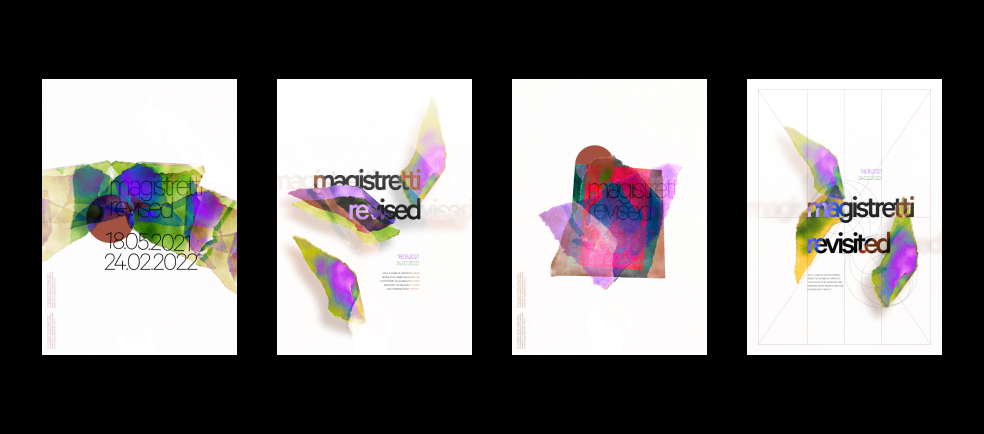
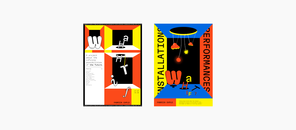
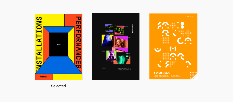
After three rounds of converging and diverging among my team we curated 3 final sets of posters as result of the graphic experimentation process, shown below. The poster we chose to push forward was based on the design quality of framing for hierachy due to its effective visual representation of the derived qualities and post-event versatility across different media; which I was responsible for (poster on the left).
Final set of posters
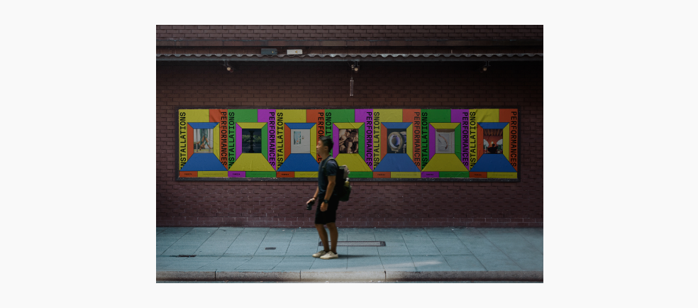
The selected poster contains a black rectangle center stating, “What If?”. This center changes and is replaced with an image of the 12 art installations curated in the What If? exhibition. Metaphorically, stating that these are the possible outcomes. Framing for hierachy is distinctively used to frame the viewers eye into the center.
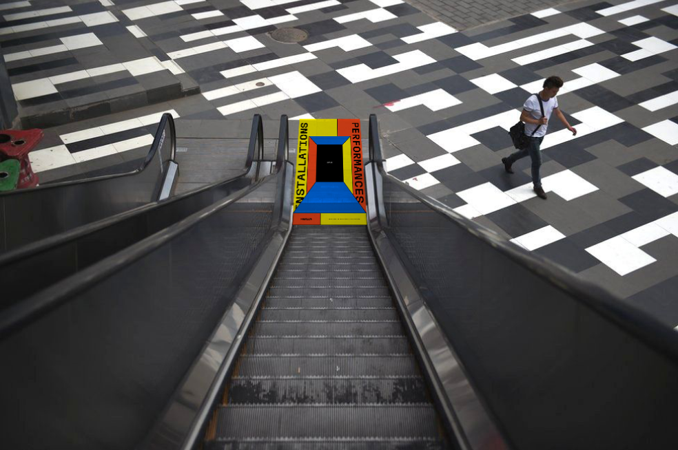
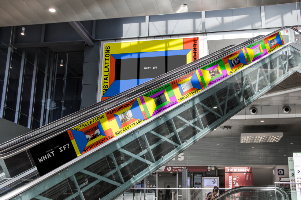
Above are mockup examples of post-event utilization as you leave the exhibition. For example, going down the escalator the poster is used as an illusion of entering the black rectangular center.
To curate an interaction that simulates creatvity, attraction, functionality, and as well as enforcing design qualities and principles from the previous weeks such as framing for hierachy; a long list of animation, distortion, and navigation techniques were explored. Three distinct methods were created to enforce core functionalities within the microsite: within navigation, scrolling, and dragging. Such methods improve the surfacing of content, provoking interactivity, and distinct characteristics to an artist.
Three methods of surfacing content through interaction:
1. Navigation to enforce depth
2. Scrolling to simulate a 3D space
3. Dragging to provoke interactivity
Navigation to enforce depth
The main home page of the microsite contains the navigation of the website. Each ring is designated for a showcased Fabricanti; names and exhibits travel around the ring. Hovering over each concentric ring shows a video related to the respective Fabricanti. Structural lines and geometric shapes enforce the center and thought provoking nature of, “entering” an art installation.
Scrolling to simulate 3D space
Creating a multidemensional space through parallax scrolling: a computer graphics technique used by web designers to create a faux-3D effect. As users scroll down a webpage, different layers of content or backgrounds move at different speeds, and this creates an optical illusion.
Navigation to enforce depth
Specific elements related to an artist and art installation are placed within the artist pages intentionally. Dragging is encouraged to simulate the playful aspect of elements within a room doing so, may reveal further content and or block content.
Mono Typefaces
Monos have right angled serifs that accentuates rigid structures.
Image Treatment
Artist content is shown with a color burn filter; allowing it to contrast with the neon yellow.
Content strategy
The imagery consists of Fabricanti’s latest works which were produced under Fabrica’s residency are showcased to promote the creative research program and encourage new applicants. Artists and main installattions are cut out and monochrome to create separation from the background.
This project taught me the constant struggle of converging. As a team and myself, we created an extreme amount of sketches and unique ideas however, strong diverging skills are required to filter out the bad and reveal the good. This is especially important within a tight time constraint and delivering substantial work is important.
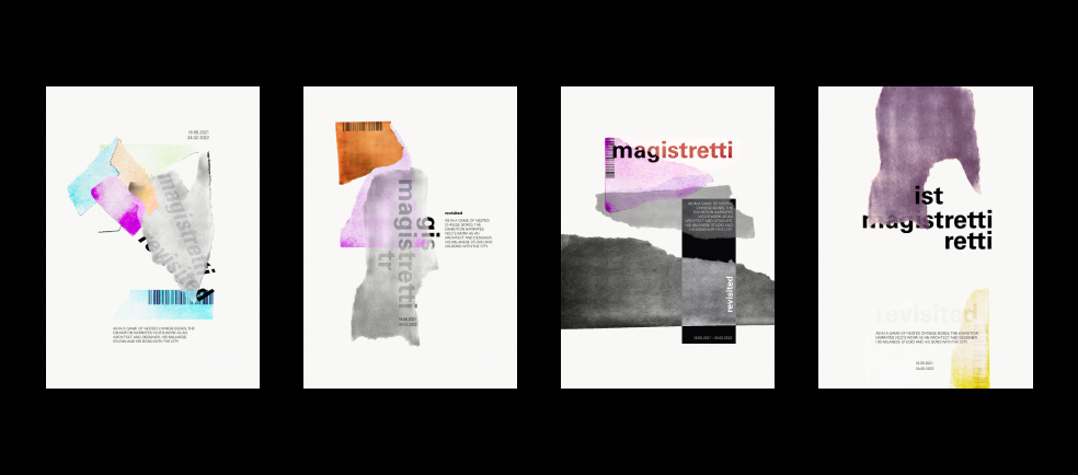
Old microsite
After one week left within this project we completely revised our old microsite concept and transformed into our current microsite within less than a week. As a team, we found strong limitations within the old microsite: that lack expressive interaction, extreme brutalism, and not providing the, “in your face” aspect we desired.
"Don't Design in Your Head"
Design is universal and by being humble and learning from those before you is rewarding. As well as assisting in ideation, learning new techniques, and discovering new methods in your own interpretation. This allows for new ideas to foster and perhaps inspire.
"Don't be Afriad to Change"
Working with a concept for weeks on end is rewarding as the amount of extreme detail and polish that can be achieve will elevate a project. However, in our case we reached a dead-end. Thus, being not afraid to pivot allowed for something much greater than we could have expected and that makes myself speechless.
"Embracing design-driven approach"
Prior to this project, I was sketpical of a design-driven approach. Abandoning the need for a problem, a user, or a need, ultimately led my team to have creative freedom, a more enjoyable experience, and an amazing project.